A University of Michigan food resource that helps ensure that members of the community - whether on a tight budget or physically restrained from getting to a grocery store - receive equitable access to healthy, nutritious, and nourishing food.
Duration: January 2024 - May 2024 (13 weeks)
Team: Maria Bronson and Anna Alvarado
My Role: UX Researcher & Designer
Scarcity Mentality
“I worry that by taking resources, I might be depriving others who need them more.”
Confusing Processes
“Am I eligible to use the food pantry? How much food can I take each visit? If they could just show the process of what to do..”
Guilt and Shame
“..stigma around freeloading off the university for free food. It made me feel weak and vulnerable, like I can't even “afford” food.”
Unpredictable Supply
“I don't know if the food I need will be available, and I don't want to waste my time.”
..these contribute to a negative emotional experience and inefficient use of resources.
Eligibility Quiz
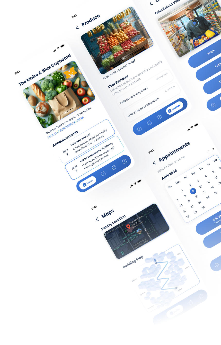
We reduced the pervasive scarcity mindset by greeting users with an eligibility quiz that reminds them that the pantry has enough food for every university ID (M-Card) holder. This also visually confirms their eligibility, which simplifies confounding processes and detracts from the guilt.
User Guide
We created a User Guide that makes the process for using the pantry clear and easy to understand before users begin, including an orientation video, building and pantry layout maps, an FAQs page, and a contact page. The FAQs also work to tackle user guilt by building on food-positive messaging.
Appointment Booking
We made it easy for users to book and view their appointments. This helps the pantry estimate the demand, which helps with inventory management while also further clarifying the process for the users. We also introduced group appointments, beyond just individual ones, to help those feeling self-conscious.
Inventory
Users can see up-to-date inventory information, read user reviews on food availability and quality, and add their own reviews to keep pantry users informed of inventory and save them time.

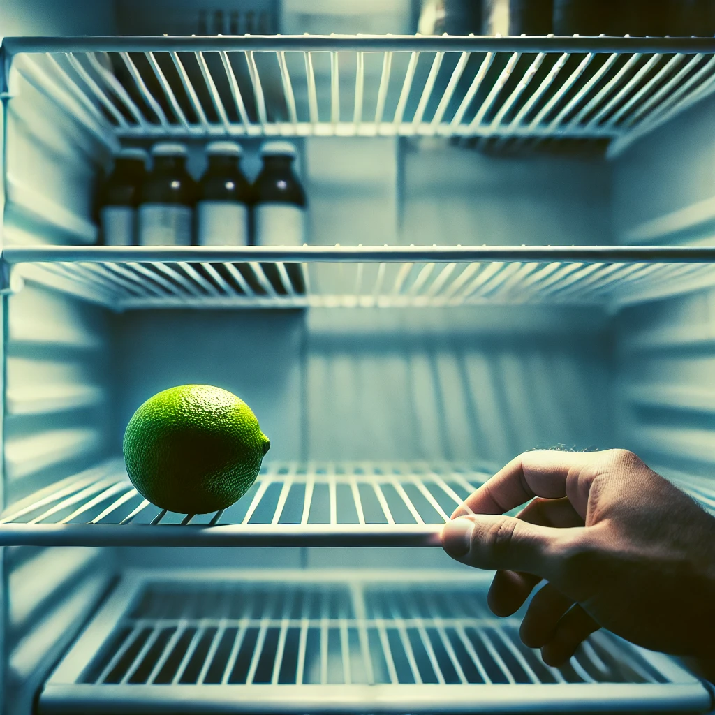
One day, a close friend confessed over a warm, hearty meal that she'd come back home a few years ago to only a lime in her refrigerator. That was all she could afford and that was all that would serve as dinner that night.
She talked of how she felt when she walked out of her college food pantry with brown paper bags while all her fellow classmates sported one that read 'Chipotle' or 'Meijer'.
The next morning, my team and I had set up a call with the Maize & Blue Cupboard.
4 months later, our solution has impacted the food security journey of over 1200 students!

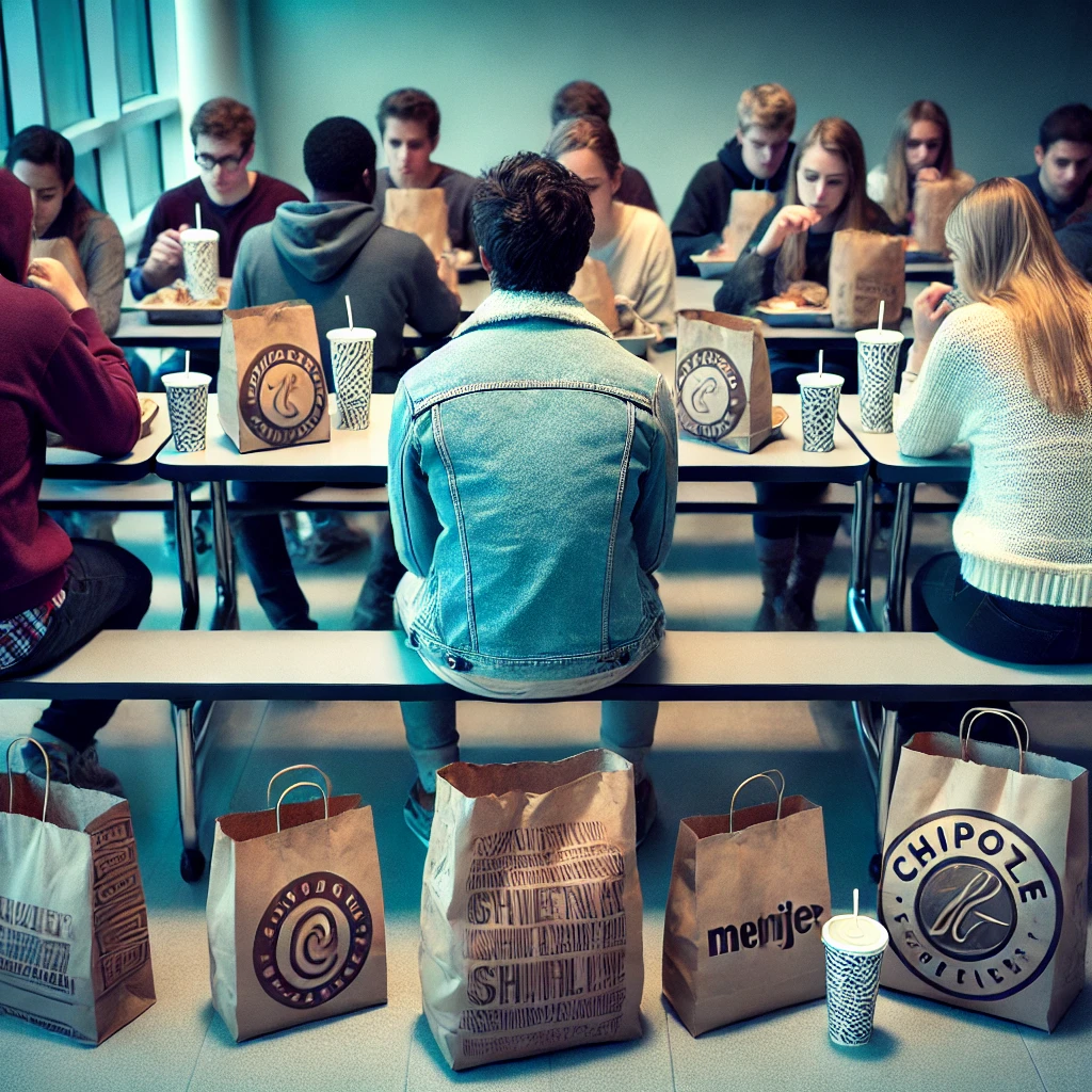


We started out supplementing our friend's experience with some white-paper research. Here's what we found:
There are not enough food pantries to meet people's needs (Martin et al., 2022), and even when people successfully find food pantries, they often report unfair and humiliating experiences (De Souza, 2019).
Using food pantries can make people feel guilty and ashamed (Bruckner et al., 2021), discouraging them from acquiring adequate food (Swales et al., 2020).
More so, poor food quality and confusing processes add to the stigma of food pantry use (De Souza, 2019; McNaughton et al., 2020), especially for people of color (De Souza, 2019) and college students (Henry, 2019).
and yet.. existing solutions to battle food insecurity often fall short and worse, result in negative emotional experiences!
How do college students feel about their experiences using food banks and food pantries?
What problems already exist in the implementation of existing solutions?
How can we improve the user experience at food pantries while prioritizing user dignity?
As part of our research, we aimed to observe, engage, and immerse users. While surveys and interviews covered observation and engagement, we planned to use contextual inquiry for immersion in the pantry environment.
But..we soon realized that there were ethical constraints surrounding the implementation of a direct observation study at a university food pantry - like compromising user privacy, or worse, amplifying discomfort and feelings of shame.
So, we decided to pivot to a cultural probe that would bring about similar insights into the users environment without compromising ethical boundaries.
We used an affinity map to collate all user data and track positives and areas of improvement along different steps in the user process. Based on this research, we populated the following user needs and design requirements. Check out our brainstorming document here!
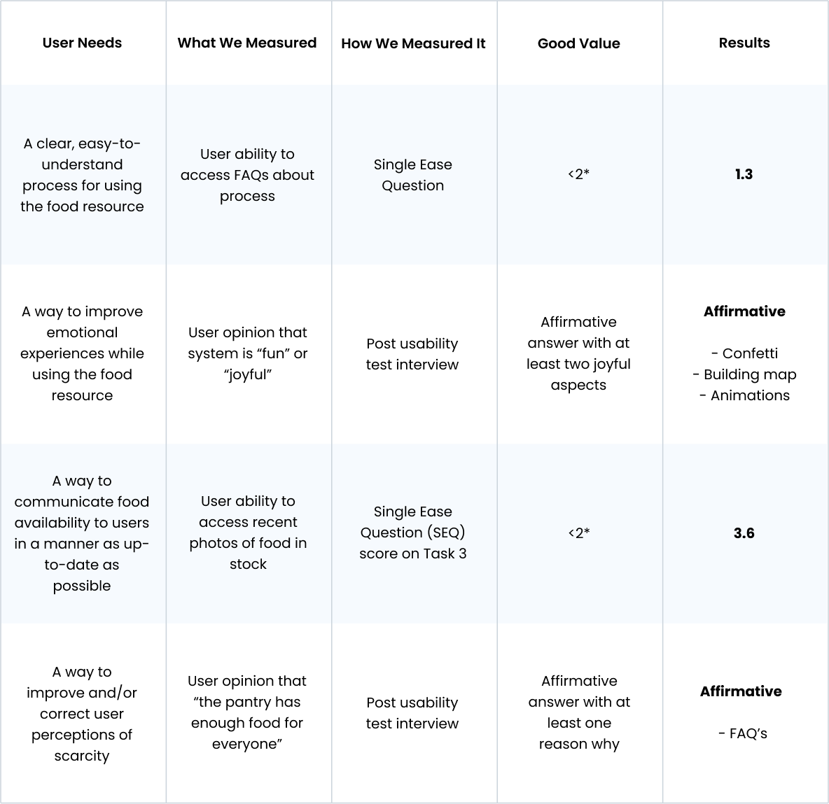
*Note: our Single Ease Question score scoring system is intentionally reversed. Check out our usability tasks and post-test questions
Using usability tests, the System Usability Scale and Single Ease Questions, here are the main improvements that were made to our design solutions:
Enhancing quiz visibility and refining task prioritization
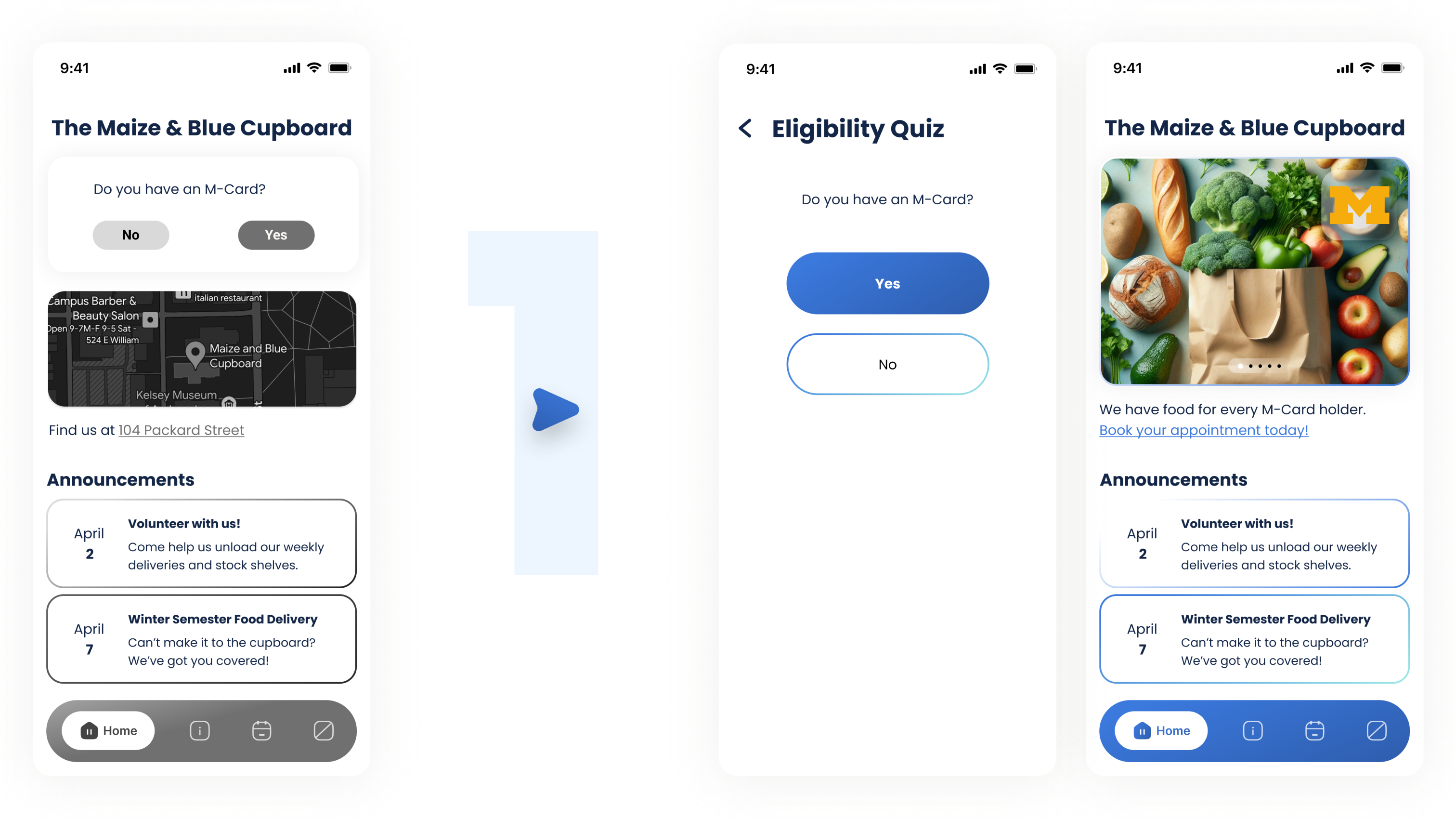
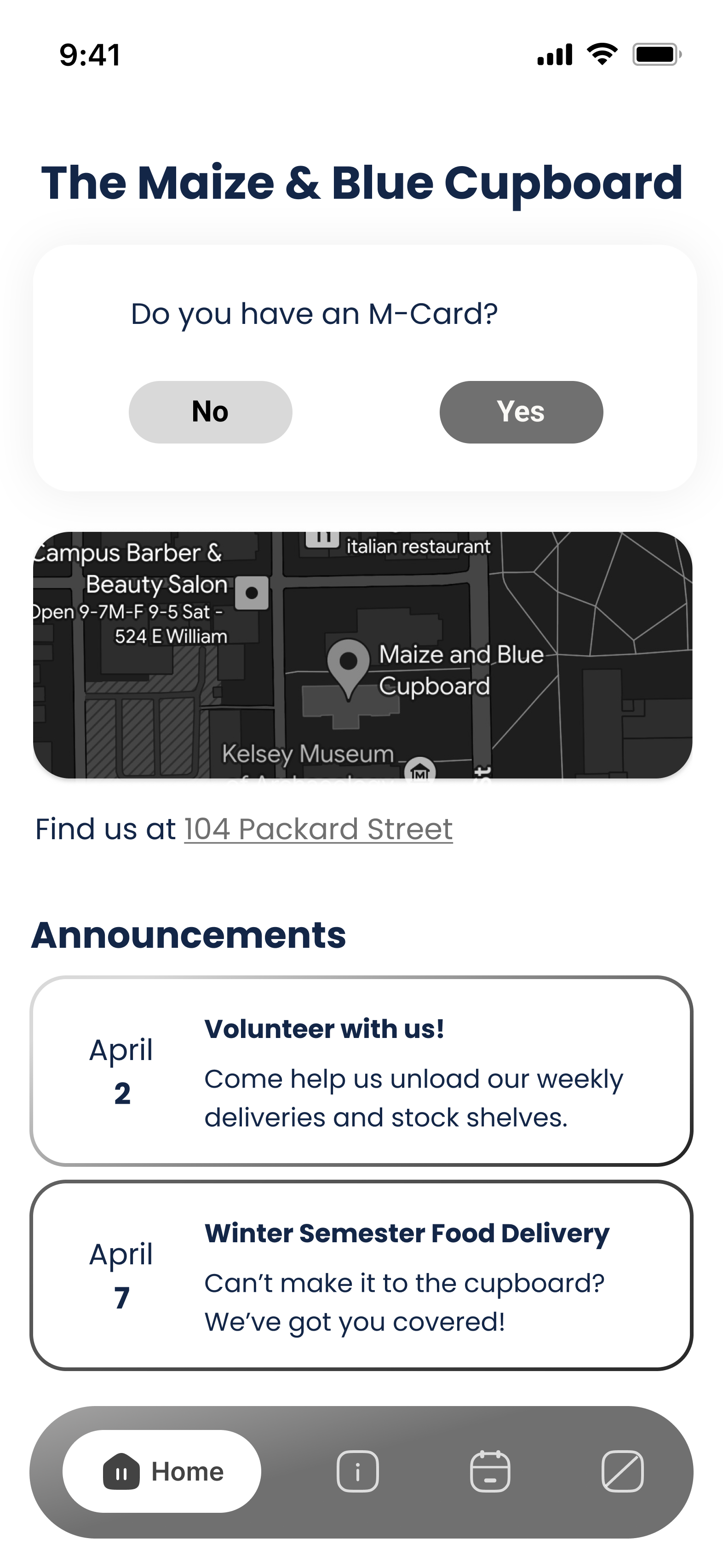

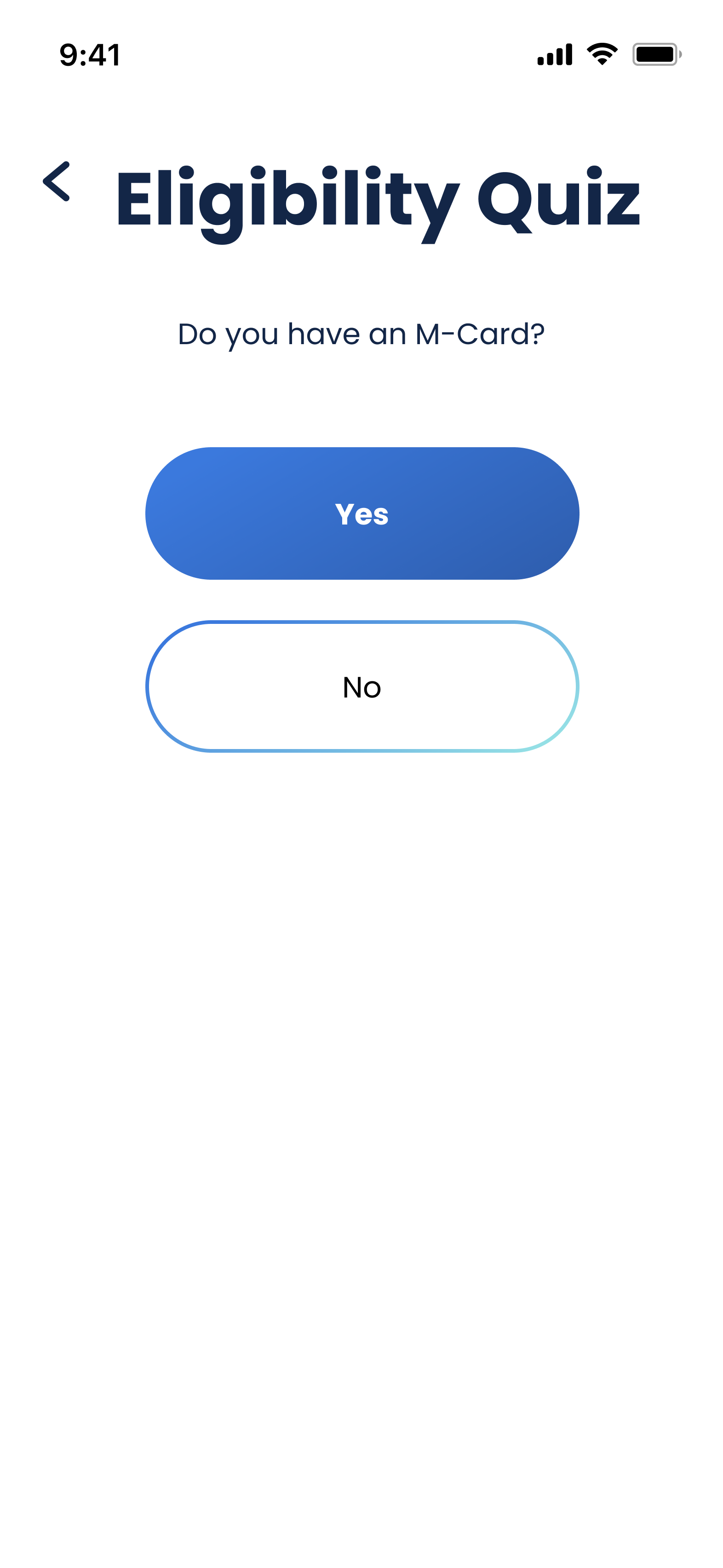
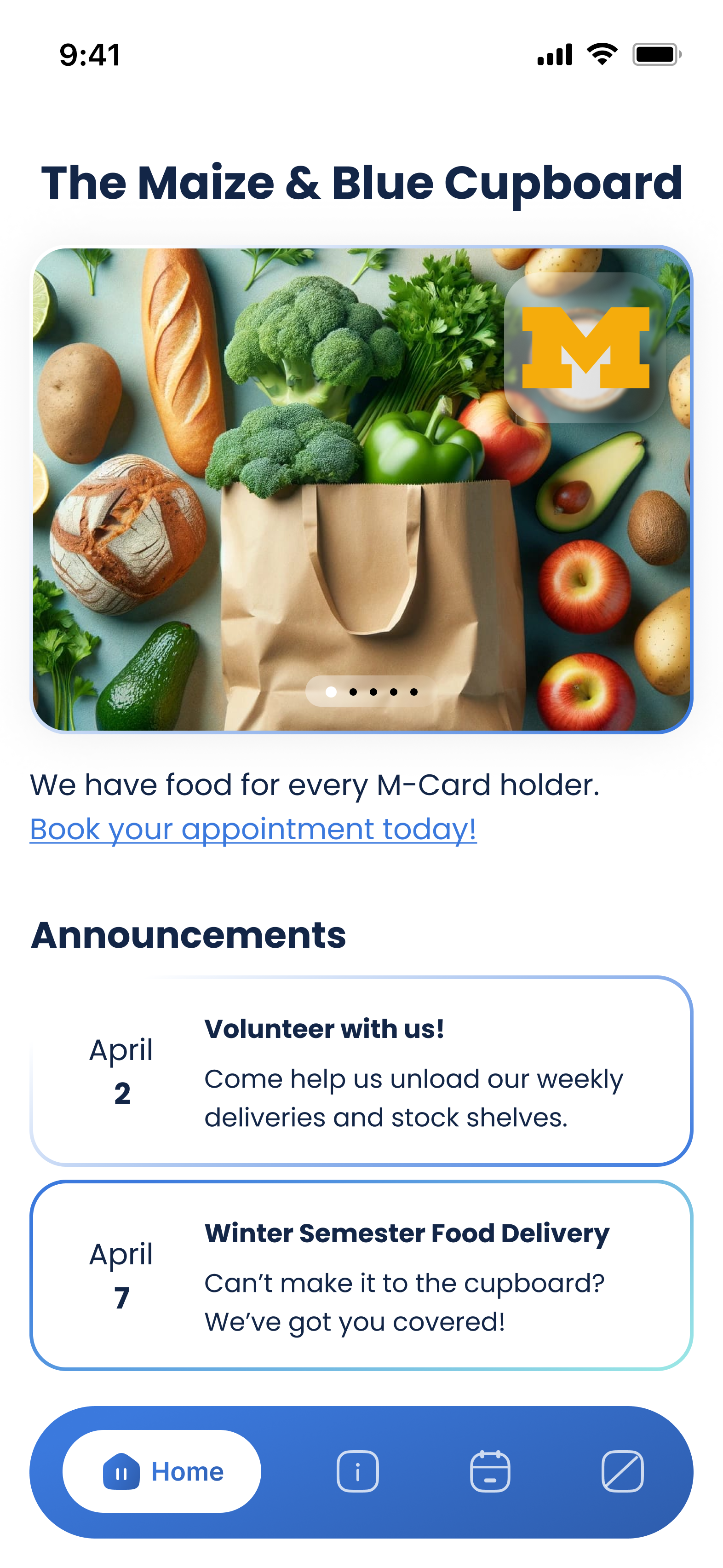
User testing revealed that we needed to make the eligibility quiz's purpose more obvious, so we moved it to its own individual page and added a clear label ('Eligibility Quiz').
Users would also rather be prompted to book an appointment (a task that is applicable to all users) than be given the location of the pantry (information that only first-time users may need).
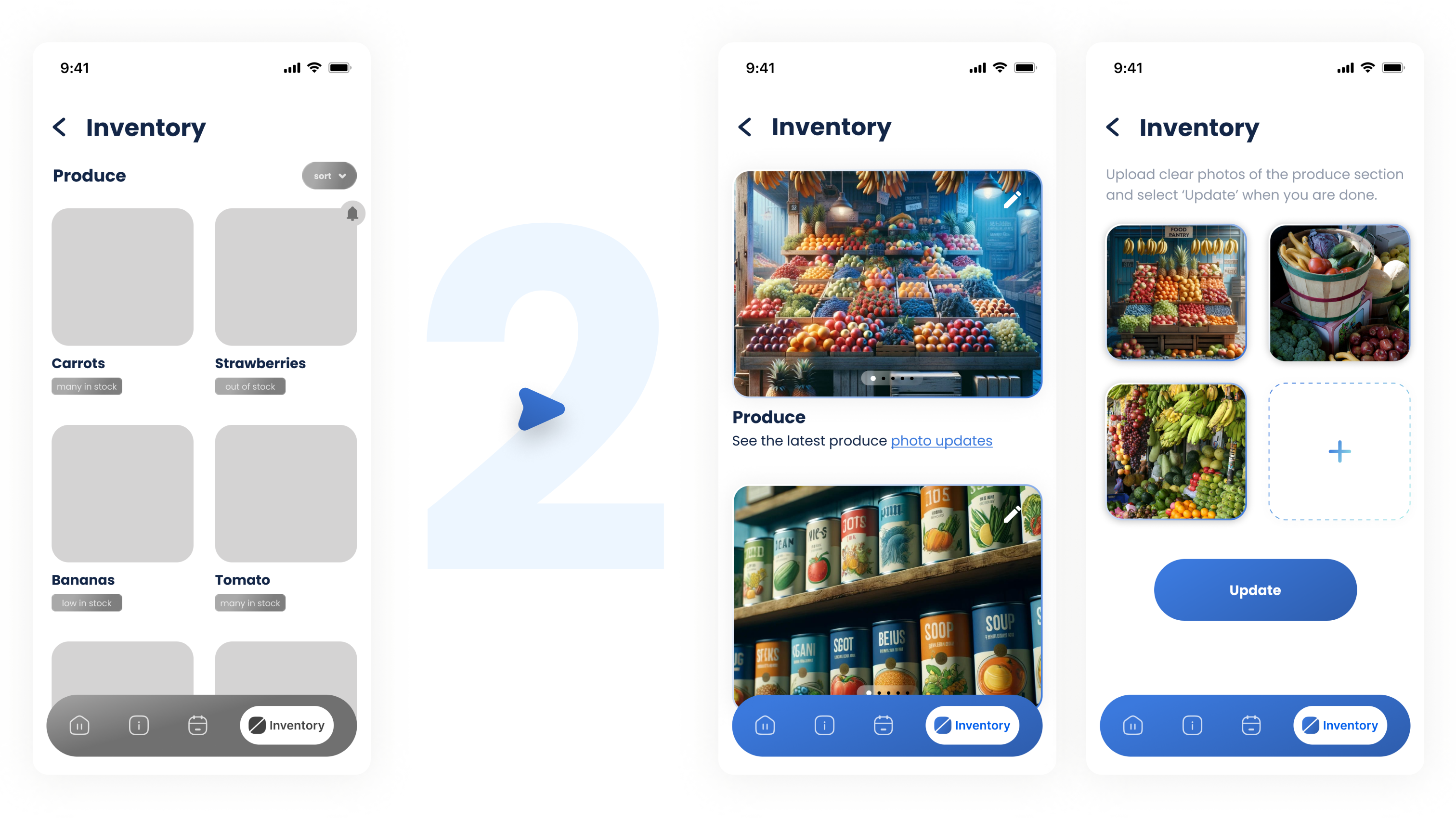
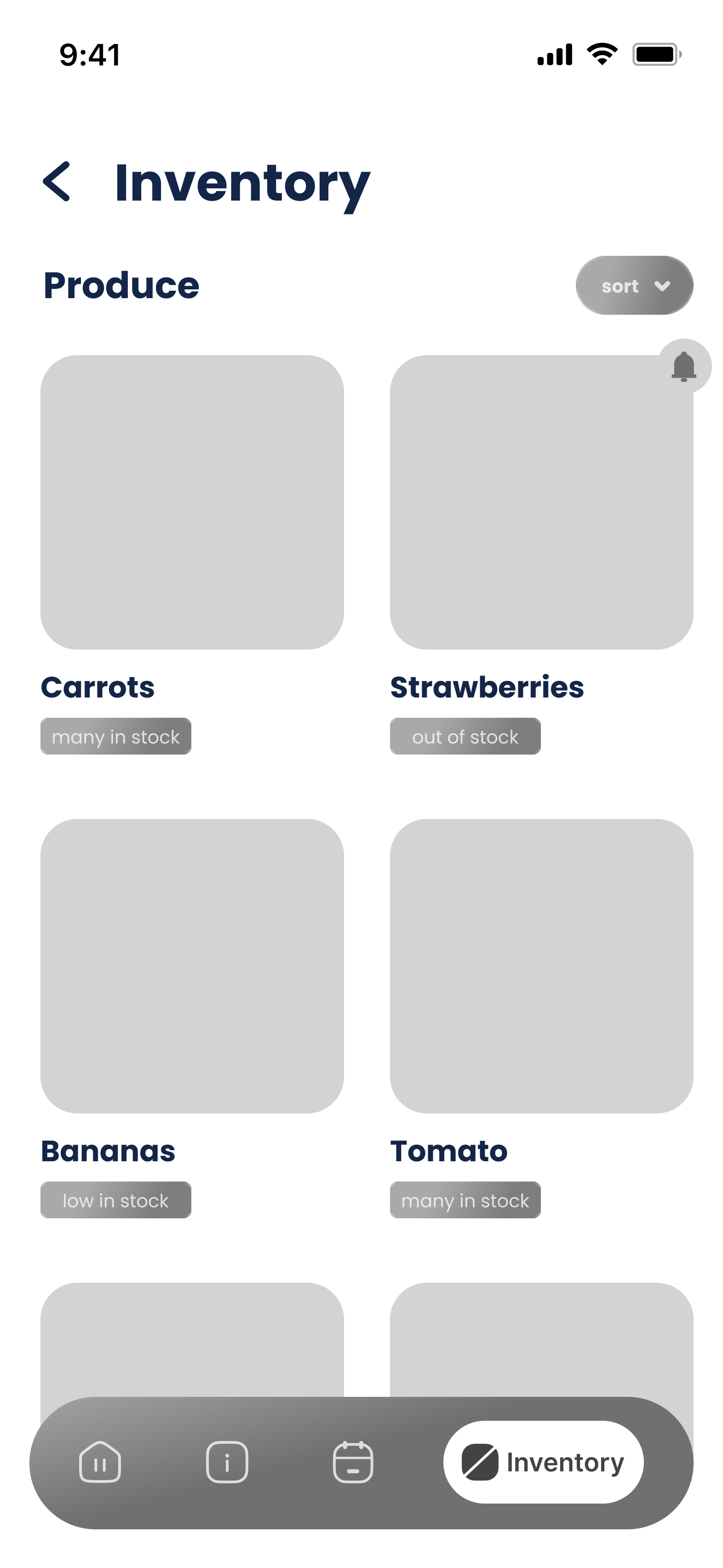


The inventory solution addressed user concerns but created a heavy cognitive burden for the lone food pantry employee (Yes, there was only 1!).
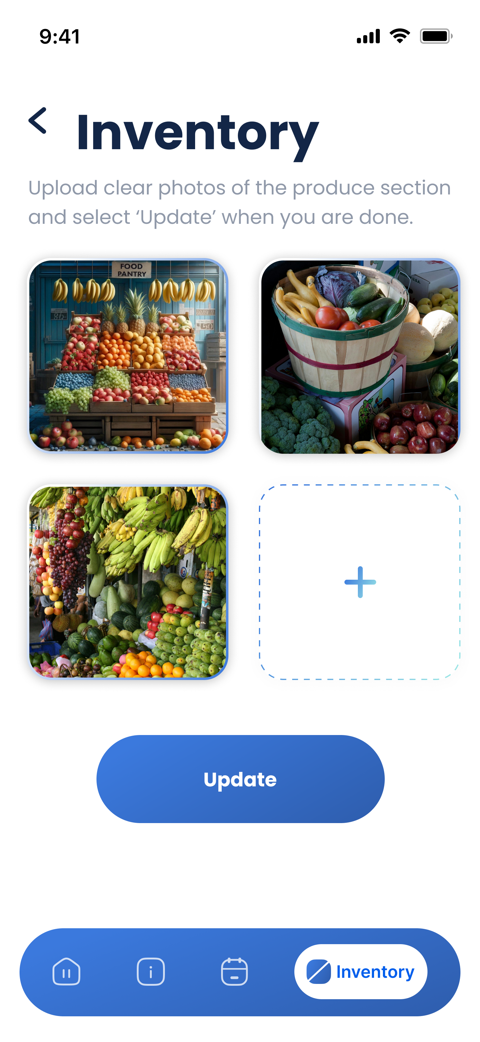
We revised the solution to reduce the employee's workload by allowing them to upload photos of the inventory (as opposed to categorizing every item as 'many', 'low', or 'out of stock'), enabling users to confirm the availability of items themselves.
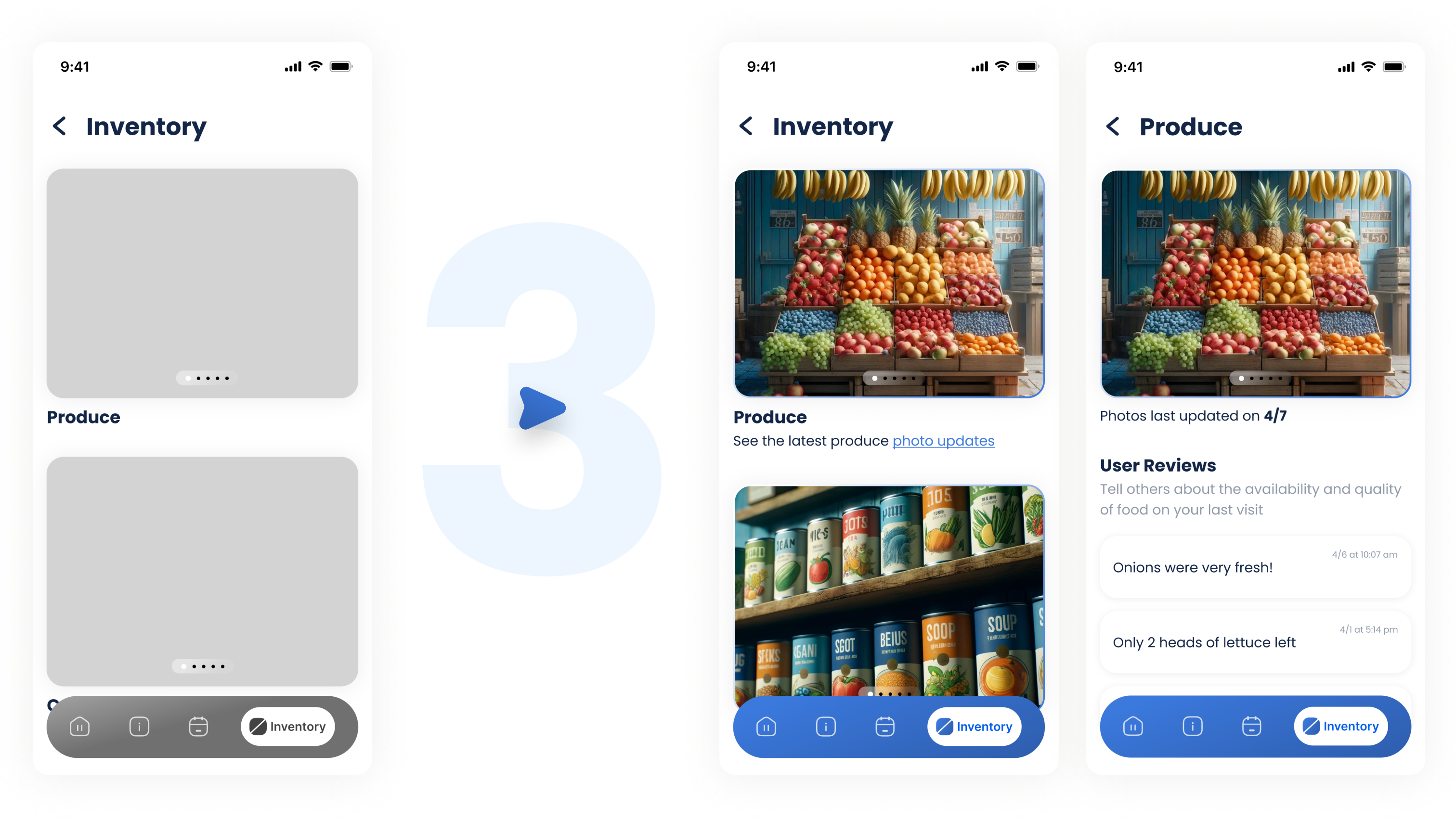
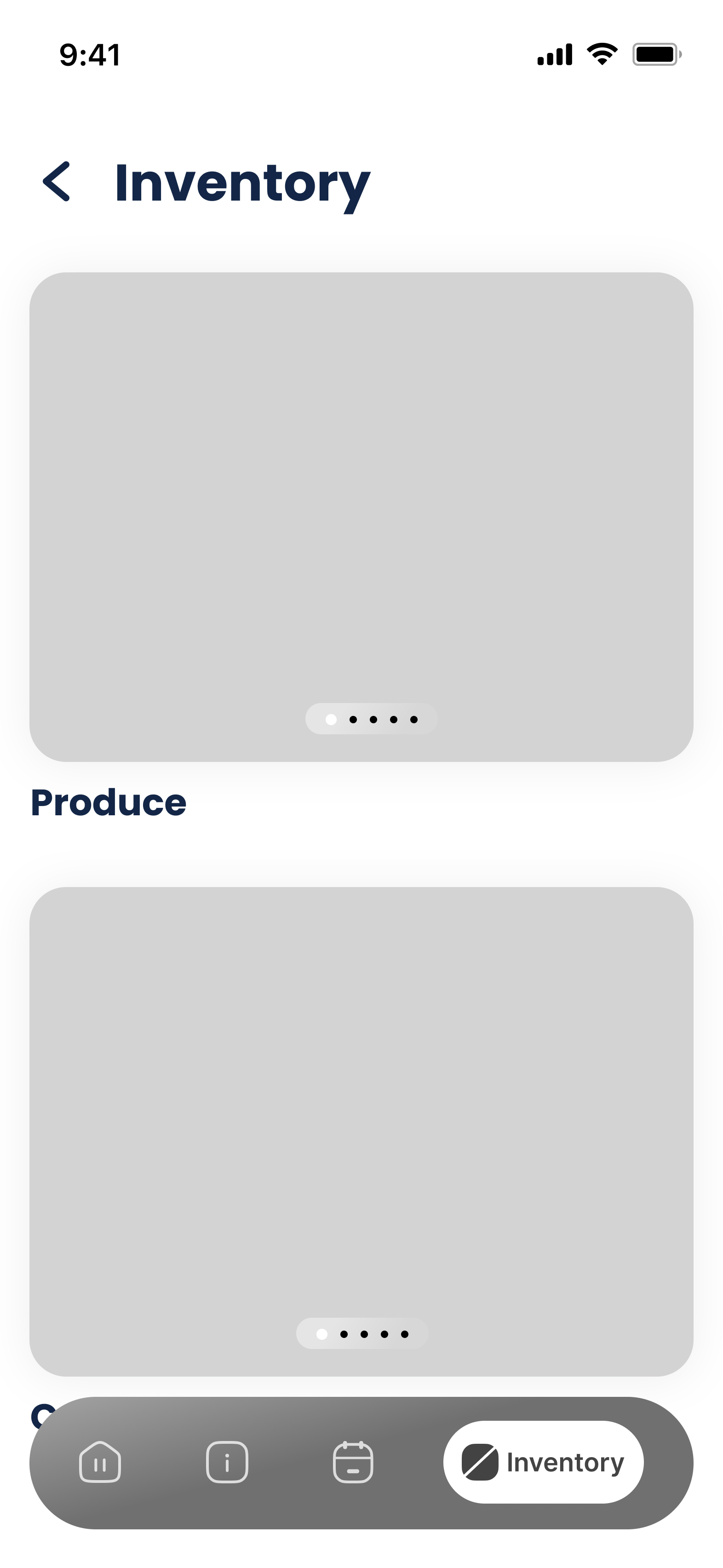

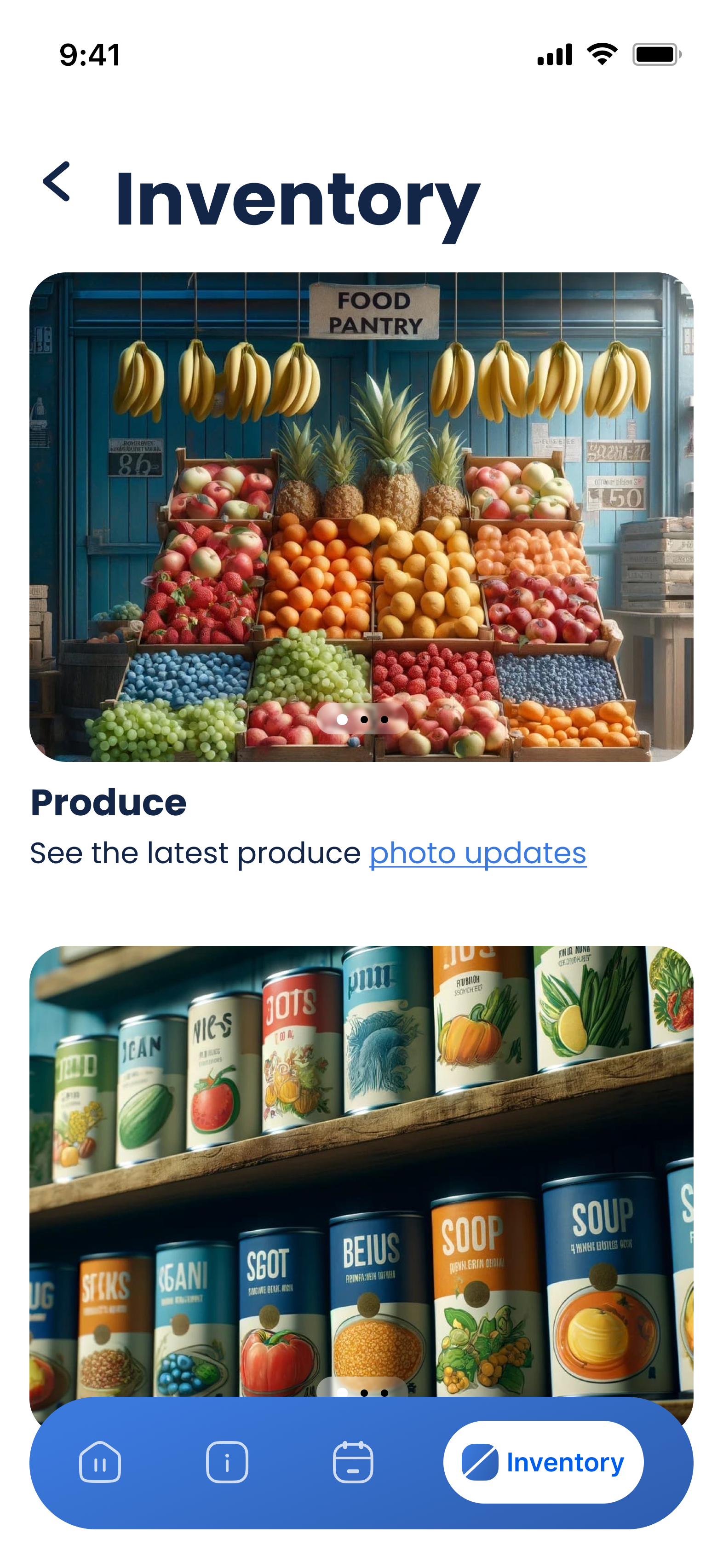

The photo-based inventory updates were often perceived as irrelevant stock photos.
So we further revised the design solution to include phrases like “See the latest Produce photo updates” or “Photos last updated on 4/7”
